Drype
Cocktails Milano
Company
Drype
Category
Visual identity proposal
Tools
Illustrator Photoshop Procreate
Timeline
April - May 2024
Description
A Milan-based startup producing water-soluble alcoholic cocktails.
Context
Problem
As Drype set its sights on expanding its product line and strengthening its position in the ready-to-drink cocktail market, it became clear that its visual identity needed an upgrade. The existing logo system was outdated and lacked versatility, missing a secondary logo mark and struggling in small-scale applications—a major limitation for a brand looking to grow and stand out.
To tackle this, Drype partnered with Terraviva Competitions to launch an international rebranding contest—one I didn’t win 😅, but I’m still proud to have placed seventh. That said, my work will be published in Terraviva’s upcoming book, highlighting standout proposals from the competition—which, honestly, is a pretty big deal for me! The goal? To create a cohesive, impactful identity that could support Drype’s expansion into new markets.


Process
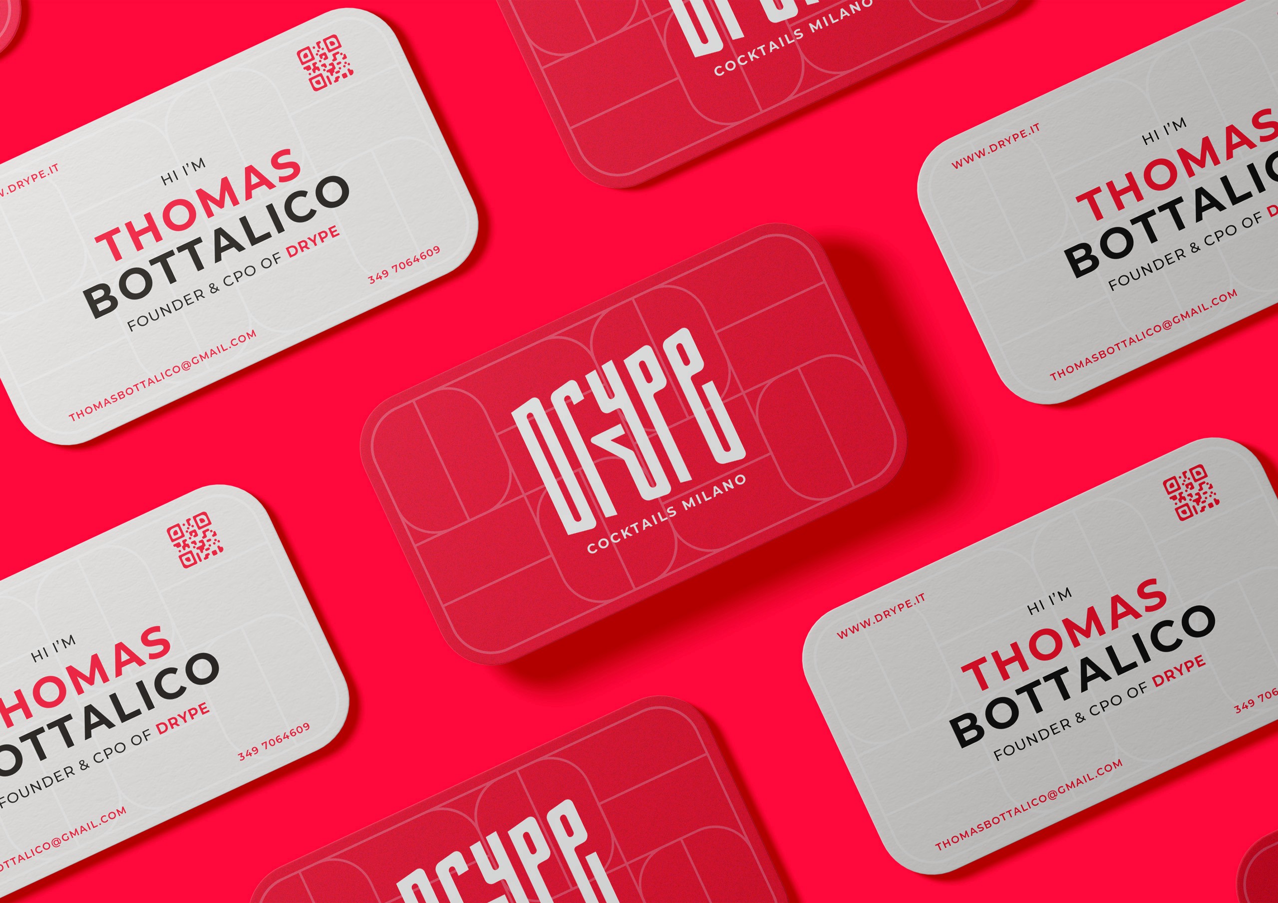
For the redesign, I built on the modern, minimal aesthetic of the existing logo while introducing key updates to elevate the brand. I chose an all-caps typeface for a more established, confident feel and created a distinctive logo mark—an abstract shape inspired by a cocktail glass. Designed for versatility, this mark could be extracted for small and medium-scale applications. In retrospect, though, it may be too abstract and doesn’t translate well to icons or favicons, making it a key area for improvement.
Result
The result is a fresh, dynamic design that remains true to Drype's core values while offering a more accurate representation of the brand’s ambitions. It positions Drype to effectively expand its product line and strengthen its foothold in the competitive ready-to-drink cocktail market.


Back to top