Fantacycling
Mobile App
Company
Fantacycling
Category
Visual identity proposal
Tools
Illustrator Photoshop Procreate
Timeline
Nov - Dec 2024
Description
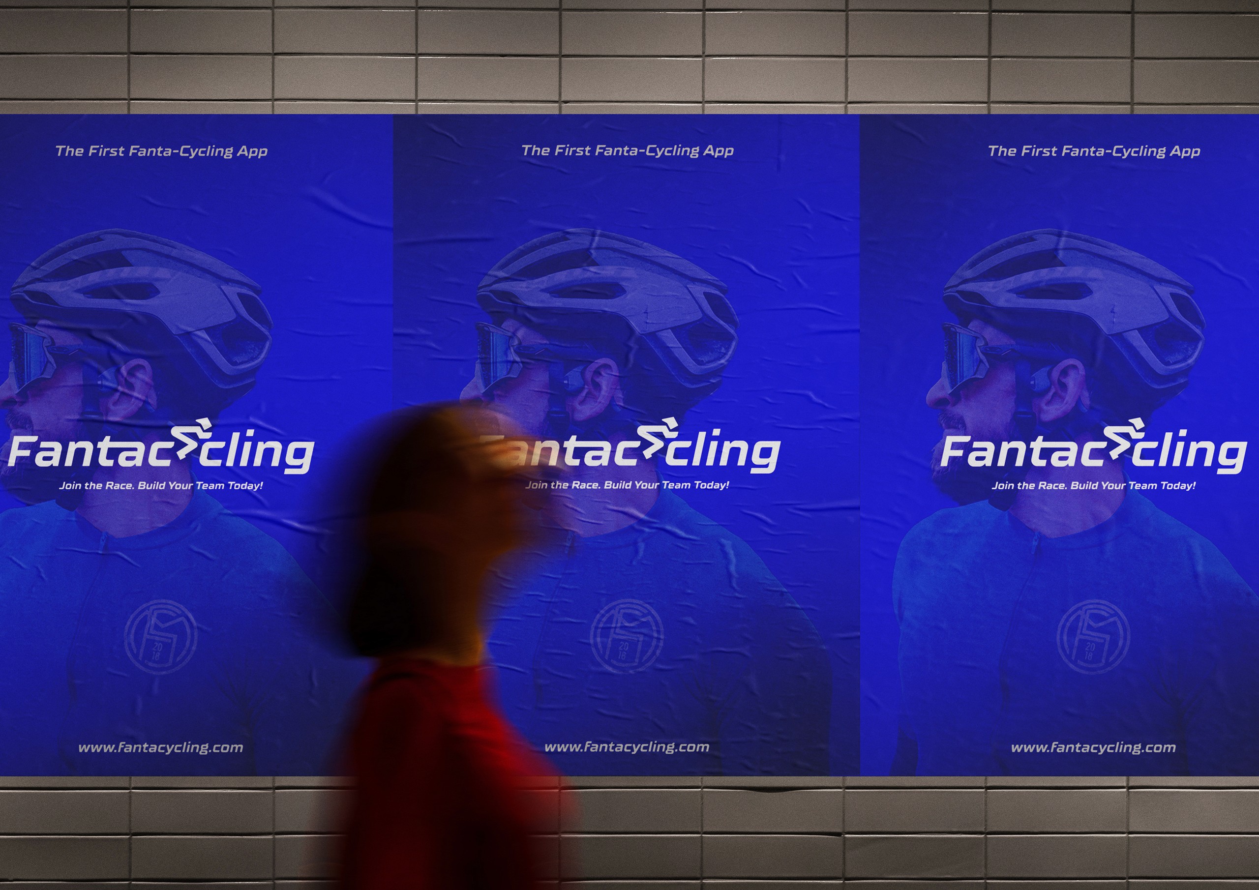
The world's first Fanta-cycling App.
Context
Problem
Fantacycling faced challenges with its brand identity, which struggled to fully represent its values and global ambitions. The original logo, while effective in the early stages, lacked clarity and failed to convey the dynamic, competitive spirit of the platform.
As the team continues to expand—developing a new app UI and designing a fresh cycling suit—they recognized the need for a stronger, more cohesive visual identity. To achieve this, they partnered with Terraviva Competitions to launch an international design competition. While I didn’t win 😅, I’m proud to have been among the top finalists, this effort aimed to create a cohesive and impactful new logo to support Fantacycling's growing fan base.


Process
With this redesign, I tried to fix key weaknesses in the existing logo that undermined the overall visual identity. These included the lack of a distinct, memorable logo mark, an uninspiring color palette, and inconsistent line weights that compromised cohesion.
To address these issues, I selected and customized a bold, dynamic typeface that better embodies the company’s competitive spirit. I also introduced a (hopefully) unique, recognizable logo mark—designed to function as both a standalone secondary logo and a favicon for small- and medium-scale applications.
Finally, with the new app UI and cycling suit in mind, I gave the brand a striking neon blue palette, infusing the identity with a fresh, modern energy that enhances both digital and physical touchpoints.
Result
The result is a more versatile and engaging identity, perfectly suited to support the brand's continued growth and dynamic personality. The redesigned logo system addressed key weaknesses in the original design while capturing Fantacycling's competitive and playful spirit.


Back to top